Instantly search and explore ShadCN UI components for Next.js and ReactJS, navbars, footers, hero sections, feature cards, and more.

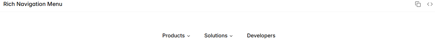
npx shadcn@latest add https://www.shadcnui-blocks.com/r/navigation-menu-06.json
npx shadcn@latest add https://www.shadcnui-blocks.com/r/navigation-menu-07.json
This tool allows you to search and explore Shadcn components, blocks, and UI elements for Next.js and React.js. You can type any component name, like responsive navigation, hero sections, blog pages, footers, accordions, feature sections, feature cards, and more, and instantly get detailed information. You can preview live code, access the npx command to install the component, and integrate it directly into your project.
If you are building Next.js or React applications, this AI powered search tool helps you find Shadcn blocks, Shadcn components, Shadcn UI, and Shadcn React elements quickly, making development faster, easier, and more productive.
The tool gives you the most relevant component, the install command, a preview image, and a link to the live demo helping you build modern, responsive, and feature-rich applications efficiently.
This tool is designed for frontend and fullstack developers working with Tailwind CSS, Next.js, and React.js, helping them find and integrate Shadcn components, blocks, and UI elements quickly.
This AI tool helps developers quickly find ShadCN UI components and blocks by simply describing what they need. Instead of manually searching through documentation or GitHub, you get instant component suggestions tailored to your description.
It is designed for Next.js, ReactJS and Javascript, and ShadCN UI developers who want to save time when building UI. You can instantly search for your needed components and blocks by just describing your block.
Simply describe your ShadCN UI component or block that you need and our tool will analyze and list the best components based on your query and needs
Yes you can use these components and blocks in your projects as ShadCN UI is open source
To install ShadCN UI in your Next.js app, run the following command: npx shadcn@latest init
This sets up the component system and generates the configuration files.
After initialization, you can add any ShadCN component using:
npx shadcn@latest add component-name
Yes, you can use shadcn/ui in a regular React project, but it requires manual setup because ShadCN is designed primarily for Next.js. To use it in React: npm create vite@latest
Now install Tailwind CSS:
npm install tailwindcss @tailwindcss/vite
Tailwind CSS is a utility first CSS framework. It gives you small, reusable classes like p-4, flex, text-lg that you combine to build any design from scratch. It doesn’t provide components, you build your own UI using utilities.
ShadCN UI, on the other hand, is a component library built on top of Tailwind CSS. It provides pre-built, ready-to-use components such as buttons, cards, modals, forms, carousels, and more